My Blog
Shopify Screen Size Design: 5 Simple Tricks for a Mobile-Friendly Store That Converts Like Crazy
Designing your Shopify store to look great on all screen sizes isn’t just nice to have. It’s essential for success in 2025. When shoppers visit your site on phones, tablets, or desktops, they expect a seamless shopping experience no matter what device they’re using.
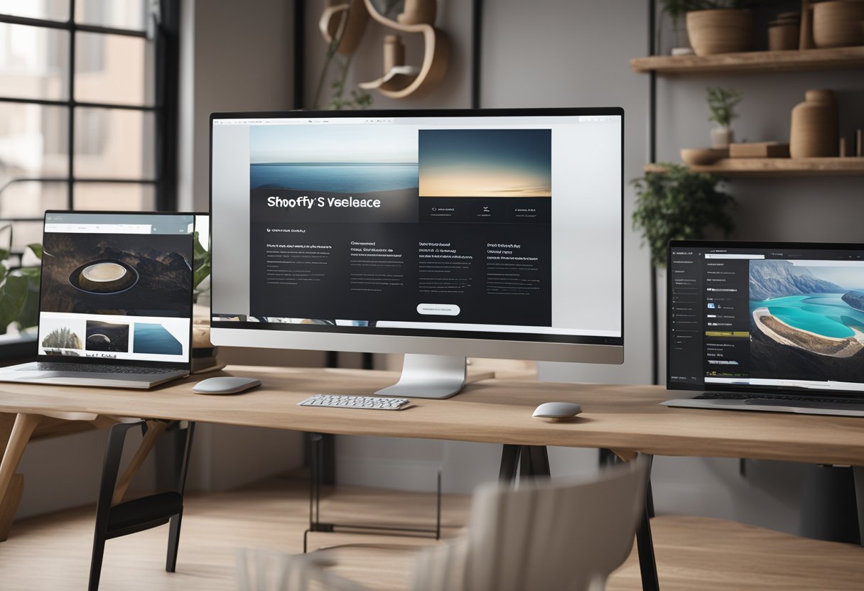
Designing your Shopify store to look great on all screen sizes isn’t just nice to have. It’s essential for success in 2025. When shoppers visit your site on phones, tablets, or desktops, they expect a seamless shopping experience no matter what device they’re using.
Responsive design principles ensure your product images, menus, and banners adjust automatically to different screen sizes. This can significantly improve your conversion rates and customer satisfaction.
Ever noticed how some online stores look amazing on your phone while others force you to pinch and zoom? The difference often comes down to thoughtful screen size planning.
For product images, experts recommend sizes like 2048 x 2048 pixels for square images. This provides enough resolution for zoom features while maintaining quick loading speeds. Your theme’s layout width also plays a crucial role in how your store appears on larger screens.
We know it can be tricky to balance aesthetics with functionality across multiple devices. That’s why understanding CSS media queries and responsive design techniques is so valuable for Shopify store owners.
Making Your Shopify Store Shine on Any Screen
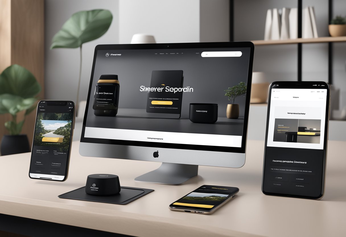
Creating a store that looks great on every device isn’t just nice to have—it’s essential. Your customers shop on phones, tablets, laptops, and desktop computers, so your store needs to look fantastic on all of them.
Understanding Responsive Design
Responsive design means your shop automatically adjusts to fit any screen size. It’s like having a store that magically rearranges itself to look perfect whether someone’s browsing on a tiny phone or a massive desktop monitor.
Official Shopify themes are built with responsiveness in mind. This means buttons stay clickable, text remains readable, and images resize appropriately no matter the device.
When we talk about responsive design, we’re really talking about flexibility. Your store’s elements will flow and adjust based on available space. This includes:
- Menus that collapse into hamburger icons on mobile
- Images that resize without losing quality
- Text that remains readable without zooming
- Buttons large enough to tap on touchscreens
A good responsive site never forces customers to pinch, zoom, or scroll horizontally. Everything just works!
The Lowdown on Shopify Themes
Shopify themes are your store’s foundation. They determine how your shop looks and feels across different devices.
Pre-built advantages: Official Shopify themes come with responsive design built in. This means less work for you and better experiences for your customers.
Most themes offer customization options that work across all screen sizes. You can adjust:
- Color schemes
- Typography choices
- Layout options
- Header styles
When picking a theme, look for ones labeled as “responsive” or “mobile-friendly.” Browse theme previews on different devices before deciding.
Many modern Shopify themes embrace minimalist design principles. This approach works well across devices since it focuses on essential elements. Clean, uncluttered designs load faster and are easier to navigate on smaller screens.
The Nuts and Bolts of Layouts and Grids
Grid systems are the invisible frameworks that keep your store organized across different screen sizes. Think of them as the shelving units that hold your digital products.
On wide desktop screens, your grid might display 4 products in a row. On tablets, it might show 2-3 products. On phones, it typically stacks them in a single column.
Image optimization is crucial. For 2025, we recommend:
- Using high-quality product images (1000-2000px wide)
- Compressing images for faster loading
- Maintaining consistent aspect ratios
- Testing how images appear on various devices
Your layout should prioritize what matters most: calls to action, product categories, and critical information. Place these elements where they’ll be seen first.
White space isn’t wasted space! Proper spacing between elements helps your content breathe and makes navigation easier, especially on touchscreens where fingers need room to tap accurately.
Optimizing Performance and User Engagement
When designing your Shopify store for various screen sizes, performance and engagement go hand in hand. Faster stores with properly optimized visuals not only rank better but also convert more visitors into customers.
Image Optimization: A Balancing Act
High-quality product images are essential for your Shopify store, but they can slow things down if not properly optimized. Finding the sweet spot between quality and file size is key!
Best practices for image optimization:
- Use Shopify’s built-in image optimizer or tools like TinyPNG to compress images
- Implement WebP format when possible (it’s 25-35% smaller than JPEG)
- Specify image dimensions in your theme code to prevent layout shifts
- Maintain consistent aspect ratios across product images
Remember that properly sized images load faster on mobile devices. This is super important since most shoppers browse on phones these days.
Shopify automatically creates responsive images that fit different screen sizes. Take advantage of this feature – it’s like having a personal image assistant!
Speed Thrills: Loading Time and SEO
We can’t stress this enough: fast-loading stores perform better in every way! Search engines love speedy sites, and customers stick around longer when pages load quickly.
Speed optimization techniques:
- Minimize CSS and JavaScript files
- Leverage Shopify’s content delivery network (CDN)
- Implement browser caching for returning visitors
- Reduce third-party apps that add extra code
Did you know that each second of load time can increase bounce rates by 20%? Yikes! That’s potential customers clicking away before seeing your awesome products.
Google considers page speed as a ranking factor, so faster stores tend to appear higher in search results. It’s a win-win for both SEO and user experience!
Designing for Conversions and Consistency
A well-designed Shopify store doesn’t just look pretty—it converts!
Strategic design choices can guide visitors toward making a purchase while providing a seamless experience across devices.
White space isn’t wasted space!
Proper padding and breathing room around elements makes your content easier to consume and your products more appealing.
Design elements that boost conversions:
- Clear, tappable buttons (at least 44×44 pixels for mobile)
- Consistent branding across all screen sizes
- Intuitive navigation that works on both desktop and mobile
- Strategic use of color to highlight important elements
Maintaining visual consistency between desktop and mobile versions helps build trust. When shoppers switch devices during their buying journey, they should feel like they’re still in the same store.


