Optimize Your E-Commerce
How to Optimize Your E-Commerce Site for Mobile Users
In today’s digital world, optimising your e-commerce site for mobile users is no longer a nice to have; it’s a must have. With mobile devices accounting for a large chunk of online shopping, a smooth mobile experience can increase user satisfaction and sales. Here are the key way…

In today’s digital world, optimising your e-commerce site for mobile users is no longer a nice to have; it’s a must have. With mobile devices accounting for a large chunk of online shopping, a smooth mobile experience can increase user satisfaction and sales. Here are the key ways to optimise your e-commerce site for mobile users.
1. Go Responsive
Responsive design is the base of mobile optimisation. It means your website adapts to different screen sizes and orientations. A responsive site adjusts its layout, images and content to fit the user’s device and provides an optimal viewing experience. This flexibility not only increases user engagement but also your site’s SEO as search engines rank mobile friendly sites higher.
2. Speed Up
Mobile users expect fast loading pages; delays can lead to high bounce rates. To speed up:
• Image Optimisation: Compress images without losing quality to reduce load times. Use WebP for better performance.
• Minify Code: Remove unnecessary characters from HTML, CSS and JavaScript files to clean up your code and speed up.
• Browser Caching: Enable caching to store frequently used resources so pages load faster on subsequent visits.
Use tools like Google PageSpeed Insights to find out the performance bottlenecks and suggestions.
3. Simplify Navigation
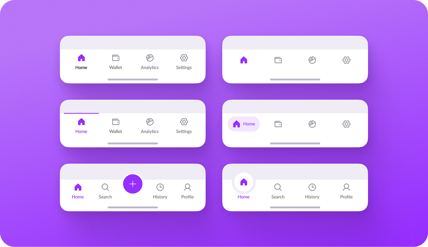
Mobile screens have limited space so navigation is key. Here are ways to simplify your site’s navigation:
• Use a Hamburger Menu: This icon based menu saves space and keeps the interface clean. Make sure it’s easily accessible.
• Add a Search Bar: A prominent search feature allows users to find products quickly and enhances their shopping experience.
• Categorise Products: Organise your products into clear categories so users can navigate easily.
4. Checkout Process
A complicated checkout process can lead to cart abandonment. Simplify this by:
• Minimising Form Fields: Only ask for essential information during checkout. Use auto-fill options to make it quicker.
• Guest Checkout: Allow users to checkout without creating an account and reduce friction in the buying process.
• Mobile Payment Options: Add mobile friendly payment methods like Apple Pay, Google Wallet or PayPal to make transactions faster.
5. Content Layout

• Simple Design: A clean and minimal layout helps users focus on key elements like product images and CTAs.
• Readable Text: Make sure text is readable without zooming. Use font sizes and line spacing to improve readability.
• White Space: Use negative space to separate elements and make your site look good and easy to navigate.
6. Test Across Devices
Testing your e-commerce site on different mobile devices and browsers is essential to ensure compatibility. Emulators can be helpful but testing on real devices will give you the most accurate results. Test for functionality, layout and speed across different platforms to find and fix issues.
Conclusion
Mobile optimisation is key to tapping into the growing mobile shopping market. By using responsive design, speeding up, simplifying navigation, optimising checkout, prioritising content layout and testing thoroughly you can create a mobile experience that delights users and converts. In a competitive digital world a mobile optimised site is not just nice to have, it’s a must have.