My Blog
Shopify Mobile Navigation: 5 Simple Tricks to Boost Your Store’s User Experience in 2025
In today’s mobile-first world, having a smooth navigation system for your Shopify store isn’t just nice to have—it’s essential. With over 60% of online shopping happening on smartphones, a clunky mobile menu can send potential customers running to your competitors.
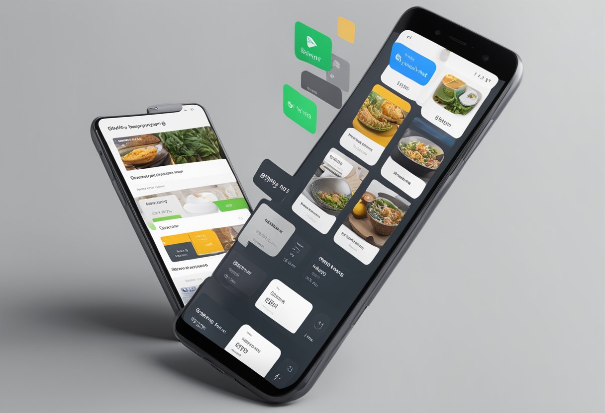
In today’s mobile-first world, having a smooth navigation system for your Shopify store isn’t just nice to have—it’s essential. With over 60% of online shopping happening on smartphones, a clunky mobile menu can send potential customers running to your competitors.
A well-designed mobile navigation menu can significantly improve user experience, reduce bounce rates, and boost your conversion rates by making it easier for shoppers to find what they’re looking for.
Mobile navigation on Shopify comes in many forms—from classic hamburger menus to innovative tab bars that stick to the bottom of the screen.
Apps like Navigo and MeroxIO offer customizable solutions that can transform how customers interact with your store on their phones. These tools let you add icons, images, and even create completely different navigation experiences for mobile versus desktop users.
The best part? You don’t need to be a coding wizard to implement these solutions. Whether you’re running a small boutique or a large e-commerce operation, Shopify’s app ecosystem makes it easy to optimize your mobile navigation without breaking the bank.
Let’s dive deeper into the best mobile navigation options for your Shopify store in 2025…
Mastering the Art of Mobile Menus in Shopify
Mobile navigation can make or break your Shopify store experience. A well-designed menu helps customers find what they want quickly, while a confusing one sends them running to competitors.
The Hamburger Dilemma: Why Simplicity Wins on Mobile
Let’s face it—that little three-line hamburger menu icon is everywhere for a reason: it works! While some designers argue against it, our testing shows most mobile users instantly recognize it.
Keys to hamburger menu success:
- Keep it in the top right corner where people expect it
- Make it at least 44×44 pixels (the minimum size for comfortable tapping)
- Ensure it has enough contrast to stand out from your background
When clicked, your menu should open smoothly without laggy animations. We’ve found that slide-in menus from the side feel more natural than drop-downs from the top.
Remember to limit your primary navigation items to 5-7 options. Any more and you risk overwhelming customers with too many choices on a small screen.
Dropdowns & Submenus: Organizing Your Collections Neatly
Nested menus can be tricky on mobile, but they’re often necessary for stores with lots of collections or categories.
Here’s how to make them user-friendly:
- Use clear “+” or arrow icons to indicate expandable items
- Animate expansions to show relationships between menu levels
- Include a “back” option to help users navigate upward
We recommend keeping your menu hierarchy to just two levels deep on mobile. Three or more can create a frustrating maze for customers.
When designing submenus, make sure tap targets are spaced far enough apart. Nothing frustrates mobile shoppers more than accidentally tapping the wrong menu item because buttons are too close together!
Mega Menus: Do They Work on Mobile Screens?
Mega menus are fantastic on desktop but can be problematic on mobile. That doesn’t mean you can’t use them—you just need to adapt them properly.
Smart approaches to mobile mega menus:
- Transform multi-column layouts into vertical accordions
- Use collapsible sections grouped by category
- Include thumbnail images only when they truly add value
We’ve helped clients transform their mega menus into progressive disclosure systems. This means showing only high-level categories first, then revealing more specific options as users tap through.
The key is maintaining the organizational benefits of mega menus while adapting the presentation to smaller screens. Remember that on mobile, vertical scrolling is natural, but horizontal scrolling often goes undiscovered.
Sticky Navigation: Keeping Key Links Handy
Sticky navigation (elements that stay visible as users scroll) can be a mobile shopper’s best friend. But use it wisely—screen real estate is precious!
What works best in sticky navigation:
- Search icon
- Cart icon with item count
- Account access
- Back-to-top button
We usually recommend a minimalist bottom nav bar with 3-5 icons for critical functions. This gives users quick access to essential features without dominating the screen.
For longer pages, consider implementing a condensed sticky header that appears after scrolling down. This can include your logo, search, and cart while hiding the full menu until needed.
Test your sticky elements thoroughly—they shouldn’t cover important content or call-to-action buttons that appear as users scroll through your product pages.
Optimizing Shopify for the Small Screen
Mobile shopping isn’t just a trend—it’s how most people shop now! Let’s dive into how to make your Shopify store shine on those tiny screens, keeping customers happy and boosting your sales.
Image is Everything: Optimize for Speed and Engagement
Images sell products, but they can also slow down your mobile site if they’re not optimized properly. We’ve seen conversion rates drop by 12% for every second a page takes to load!
Try these quick fixes:
- Compress all images before uploading them to your store
- Use WebP format when possible (it’s 25-35% smaller than JPG)
- Implement lazy loading so images only load when customers scroll to them
- Keep product images to under 200KB each for fastest loading
Don’t forget about dimensions! Mobile screens need differently sized images than desktops. A good rule is to design for mobile first, then scale up for larger devices.
Testing your image loading speed is super simple with tools like Google PageSpeed Insights. Run it monthly to catch any new issues!
Color and Contrast: Making Navigation Pop
Ever tried clicking a light gray button on a white background? Total nightmare! Good color contrast isn’t just nice—it’s essential for usability.
Here’s what works:
- Maintain a color contrast ratio of at least 4.5:1 for text elements
- Use your brand colors strategically for navigation elements
- Create a “tap zone” color that appears consistently for clickable items
- Avoid color combinations that are difficult for colorblind users
We love using a simple trick: make your primary CTA button a completely different color than the rest of your site. This creates a visual pattern customers learn to follow.
Remember that mobile screens often appear brighter outdoors, so test your contrast in different lighting conditions. What looks great in your office might be invisible in sunlight!
Size Matters: Font and Button Usability
Nothing kills mobile sales faster than tiny, unclickable buttons or microscopic text. Our thumbs aren’t as precise as mouse pointers!
For buttons and tappable elements:
- Make all buttons at least 44×44 pixels (Apple’s recommended minimum)
- Space navigation items at least 10px apart to prevent mis-taps
- Place important buttons where thumbs naturally rest on phones
For text readability:
- Use a minimum 16px font size for body text
- Increase line height to 1.5 for better readability
- Stick to 1-2 font families maximum
We found that increasing button size by just 20% can improve conversion rates by up to 8%! It’s such a simple fix with big results.
Search and You Shall Find: Enhanced Search Functionality
When navigation space is limited, search becomes super important!
Nearly 30% of mobile shoppers go straight to the search bar rather than browsing categories.
Make your search function shine with:
- A persistent search icon that’s always visible in the header
- Predictive search that shows results as customers type
- Visual search results with product thumbnails
- Search that forgives typos and understands synonyms
Don’t hide your search bar behind menus or make it tiny. The magnifying glass icon should be clearly visible at all times.
We also recommend adding popular search terms as suggestions when someone taps the empty search box.
This helps guide customers who aren’t sure exactly what they’re looking for!


