My Blog
Shopify Mobile Navigation: 5 Game-Changing Tips to Boost Your Sales in 2025
Navigating a Shopify store on mobile can make or break your customer’s shopping experience. With more shoppers using phones to browse and buy, having a user-friendly mobile navigation menu isn’t just nice to have—it’s essential for success. A well-designed mobile menu can increas…
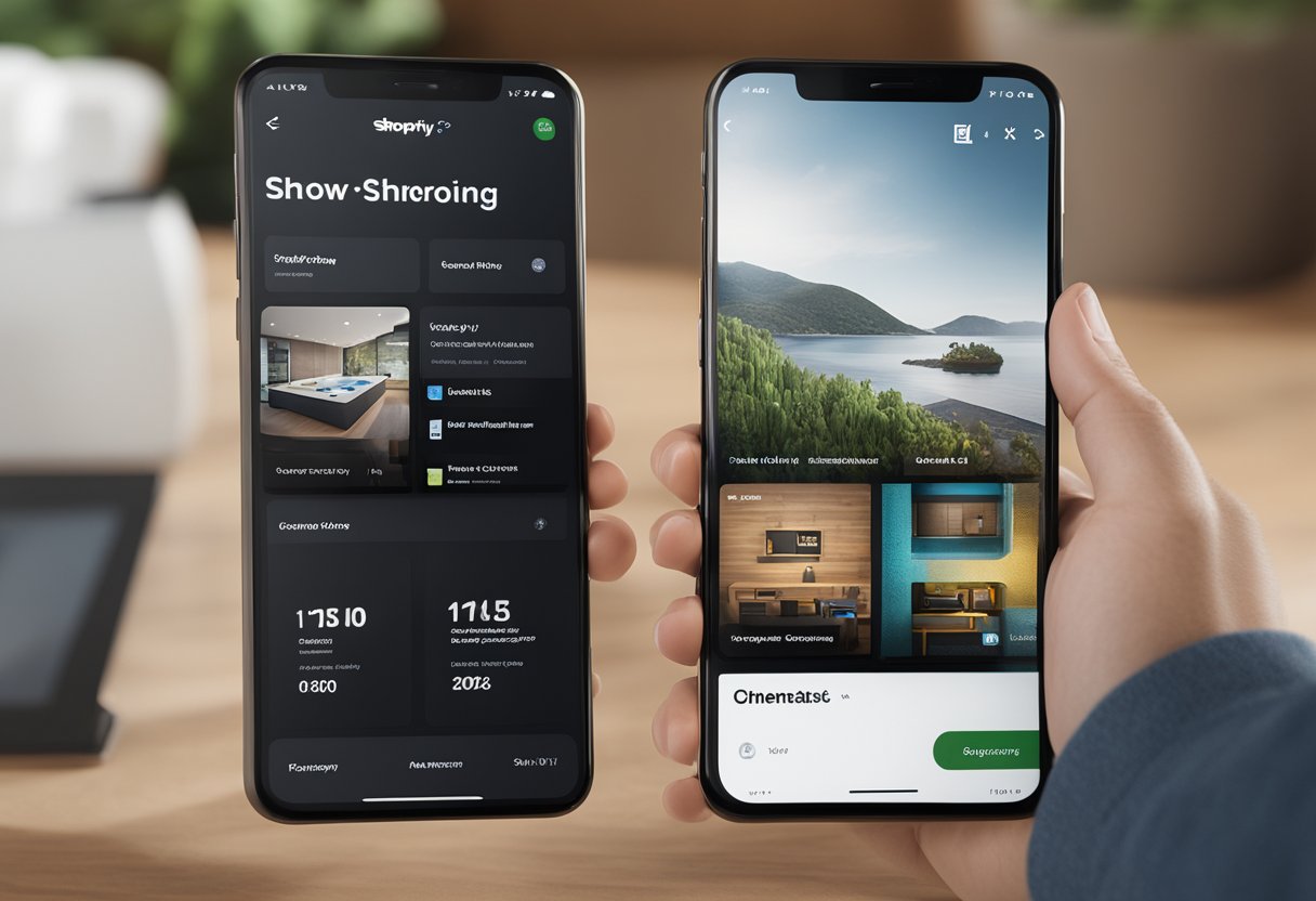
Navigating a Shopify store on mobile can make or break your customer’s shopping experience. With more shoppers using phones to browse and buy, having a user-friendly mobile navigation menu isn’t just nice to have—it’s essential for success. A well-designed mobile menu can increase your conversion rates by up to 30% by helping customers find what they need quickly and easily.
Have you ever clicked away from a site because you couldn’t figure out how to get around? Your customers feel the same way! That’s why Shopify offers several app options like Navigo, Navi+ TabBar, and MeroxIO Sticky Mobile Menu that can transform how people navigate your online store on small screens. These tools let you create custom menu bars with icons, images, and tabs that guide visitors exactly where they need to go.
We know that building the perfect mobile shopping experience can seem tricky, but with the right navigation setup, you’ll keep customers browsing longer and buying more.
Setting Up Your Shopify Mobile Menu
Creating an effective mobile menu can make or break your customer’s shopping experience. A well-designed navigation system helps visitors find products quickly and boosts your conversion rates.
Choosing the Right Shopify Theme
Finding a responsive theme is your first step to mobile menu success. Not all Shopify themes handle mobile navigation equally well!
Look for themes with these mobile-friendly features:
- Responsive design that automatically adapts to different screen sizes
- Hamburger menu support that neatly tucks away navigation options
- Touch-friendly elements with proper spacing between menu items
We recommend checking theme reviews specifically for mobile performance. Many themes look great on desktop but fall short on phones and tablets.
Test your theme on multiple mobile devices before committing. Pay attention to how the menu opens, closes, and whether submenu items are easy to access. Some premium themes include advanced mobile navigation options like sticky headers that stay visible as customers scroll.
Customizing Menu Layout
Once you’ve chosen your theme, it’s time to make that mobile menu shine with smart customization.
To access your menu settings:
- Go to your Shopify admin panel
- Navigate to “Online Store” → “Navigation”
- Select your main menu or create a new one
Consider these mobile-specific layout tips:
- Keep it minimal – limit main menu items to 5-7 options
- Use clear labels like “Shop,” “About,” and “Contact”
- Organize logically with your best-selling categories at the top
We’ve found that nested menus (dropdowns within dropdowns) often confuse mobile users. Instead, create a flatter structure with fewer levels.
Remember that mobile screens have limited space. Each menu item should be immediately understandable. Test your menu with friends who aren’t familiar with your store to ensure it’s intuitive.
Optimizing Navigation Elements
The final touch is optimizing how your menu elements look and function on mobile devices.
Here are our top optimization suggestions:
- Increase touch targets to at least 44×44 pixels to prevent misclicks
- Boost contrast between text and background for better readability
- Adjust font sizes to be readable without zooming (16px minimum)
Color plays a huge role in mobile usability. Make sure your menu colors match your brand while maintaining excellent contrast. Dark text on light backgrounds often works best for readability.
Consider adding visual cues like small arrows to indicate dropdown menus. These subtle hints help users understand how to navigate your store.
Test your menu’s load time too! Heavy images or complex animations can slow down your mobile navigation. We recommend using simple icons rather than images for menu items when possible.
Enhancing Mobile User Interaction

Creating a seamless mobile experience is crucial for your Shopify store’s success. When users can easily navigate and interact with your site on their phones, they’re more likely to stay longer and complete purchases.
Improving Mobile Responsiveness
Mobile responsiveness isn’t just nice to have—it’s essential. Google’s mobile-first indexing means your site’s mobile version directly impacts your search engine rankings.
Start by choosing a responsive Shopify theme designed with mobile users in mind. These themes automatically adjust your store’s layout based on screen size.
Check your store on various devices to spot any issues. Pay attention to:
- Text size (should be readable without zooming)
- Button size (big enough for finger taps)
- Menu navigation (easy to use on small screens)
- Image loading speed (optimized for mobile data)
Consider your header section carefully. Keep it simple with only essential navigation options visible. You might use a hamburger menu to hide secondary options.
Footer navigation should include only the most important links for mobile users. Remember, scrolling to the bottom on mobile takes more effort!
Incorporating Effective Calls-to-Action
Your call-to-action buttons can make or break your mobile conversion rates. Make them stand out with:
- Contrasting background colors that pop against your site design
- Clear, action-oriented text (“Shop Now” or “Add to Cart”)
- Sufficient size for easy tapping (minimum 44×44 pixels)
- Strategic placement within the user’s thumb zone
Don’t crowd multiple CTAs together. Give each button breathing room to prevent accidental clicks.
Consider using sticky CTAs that follow users as they scroll. This keeps important actions like “Add to Cart” or “Check Out” always accessible.
Testing different CTA styles can reveal what works best for your audience. Try variations in color, text, and placement to find the winning combination.
Streamlining the Checkout Process
A complicated checkout is the quickest way to lose mobile customers. Simplify yours by removing unnecessary steps.
Enable autofill for forms. This way, returning customers don’t have to type everything again. This small convenience can significantly boost completion rates.
Add multiple payment options, including:
- Shop Pay
- Apple Pay
- Google Pay
- PayPal
These quick payment methods reduce friction dramatically on mobile devices.
Display a progress indicator so shoppers know exactly how many steps remain. This transparency helps reduce checkout abandonment.
Optimize your checkout page loading speed. Each second of delay can decrease conversions by up to 7%!


