My Blog
Shopify Checkout Branding: 5 Simple Tricks to Wow Your Customers and Boost Sales in 2025
When you run an online store on Shopify, your checkout page is where the magic happens – where browsing turns into buying. But a generic checkout that doesn’t match your brand’s look and feel can confuse customers or make them hesitate before completing their purchase.
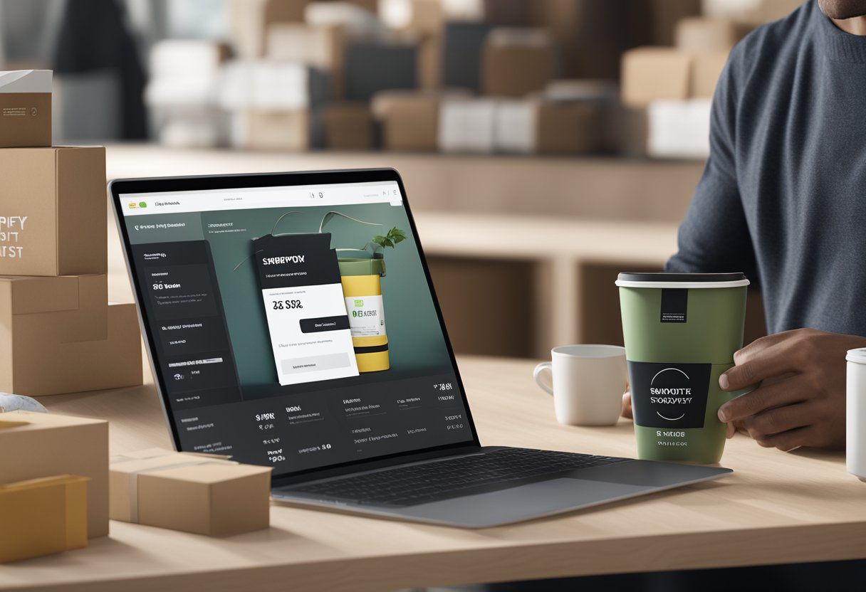
When you run an online store on Shopify, your checkout page is where the magic happens – where browsing turns into buying. But a generic checkout that doesn’t match your brand’s look and feel can confuse customers or make them hesitate before completing their purchase.
With Shopify’s Checkout Branding tools, you can customize colors, fonts, images and other visual elements to create a seamless brand experience from homepage to purchase confirmation.
Have you ever noticed how the most successful e-commerce stores maintain their unique style throughout the entire shopping journey? That’s no accident!
Shopify offers multiple ways to personalize your checkout, from the simple style editor available to all merchants to the more advanced Checkout Branding API for Shopify Plus users. This level of customization helps build trust with your customers and reduces the chance they’ll abandon their cart.
Ready to transform your store’s checkout from bland to brand-perfect? Let’s dive deeper into how Shopify’s checkout branding options work, which ones are right for your business, and the simple steps you can take to make your checkout experience as memorable as the rest of your online store…
Maximizing Your Brand Impact at Checkout
Your checkout page is the final touchpoint before a customer completes their purchase. Making it reflect your brand can build trust and boost sales while creating a seamless shopping experience.
Why Checkout Matters for Branding
The checkout page isn’t just where money changes hands—it’s your last chance to reinforce your brand identity. Many merchants overlook this crucial touchpoint, creating a disconnect in the customer journey.
When shoppers reach checkout and suddenly find themselves in a generic-looking space, it can create doubt. Does this look trustworthy? Is this still the same store I was just shopping with?
Research shows that branded checkouts can increase conversion rates by up to 15%. This happens because customers feel more confident completing their purchase in an environment that matches the rest of your store.
Brand consistency builds trust, and trust leads to completed sales. It’s that simple!
Crafting a Unique Checkout Experience
Start with the basics: your logo, colors, and fonts should match your overall brand style. But don’t stop there—think about your checkout’s overall feel.
Simple customizations that make a big difference:
- Add your logo at the top of the page
- Use your brand colors for buttons and accents
- Match fonts to your website’s typography
- Include a branded banner image
With Shopify’s Checkout Branding API, you can now go beyond these basics. You can adjust layouts, add custom elements, and create a truly unique flow.
Consider your brand personality. Are you playful? Luxurious? Minimalist? Your checkout should reflect this through its design elements and messaging.
Remember that different customer segments might need different checkout experiences. Test variations to see what works best.
Tips for Personalized Checkout Pages
Make your checkout page work harder for your brand with these practical ideas:
-
Add social proof: Include a few short customer reviews or trust badges where visible during checkout.
-
Personalize the experience: Use the customer’s name and show items in their cart with high-quality images.
-
Keep it simple: Remove distractions and unnecessary fields. The easier it is to complete, the better!
-
Offer multiple payment methods: Different customers prefer different ways to pay. Accommodate their needs.
-
Include post-purchase surprises: A special discount code or thank you message can leave a lasting impression.
Test everything! What works for one brand might not work for another. Pay attention to your analytics to see where customers might be dropping off.
Remember that mobile optimization is essential—most shoppers complete purchases on their phones these days. Make sure your branded checkout looks good on small screens too!
Enhancing Conversion with eCommerce Know-How
Smart checkout optimization can dramatically boost your store’s sales. We’ve gathered proven strategies that can help transform browsers into buyers while creating a seamless shopping experience.
Reducing Cart Abandonment
Cart abandonment is every online merchant’s nightmare. On average, about 70% of shoppers leave without completing their purchase! Here’s how to keep customers moving through checkout:
Display progress indicators so shoppers know exactly where they are in the process. Nobody likes uncertainty during checkout.
Offer multiple payment options including credit cards, PayPal, and Shop Pay. The more choices you provide, the better your chances of conversion.
Add trust signals throughout your checkout:
- Security badges
- Customer reviews
- Money-back guarantees
- Clear return policies
Exit-intent popups can work wonders! When someone’s about to leave, try offering a small discount to save the sale. We’ve seen this tactic recover up to 15% of abandoning shoppers.
Leveraging Discounts and Free Shipping
Free shipping remains the most powerful conversion tool in your arsenal. When shoppers see “free shipping,” their purchase likelihood jumps dramatically.
Set a minimum threshold for free shipping that’s slightly above your average order value. This encourages customers to add just one more item to their cart.
Create urgency with limited-time offers. Countdown timers showing when a discount expires can boost conversion rates by creating FOMO (fear of missing out).
Try these proven discount strategies:
- First-time customer discounts
- Bundle deals (buy more, save more)
- Loyalty points programs
- Seasonal promotions
Pro tip: Display shipping costs early in the checkout process. Surprise fees at the final step are conversion killers!
Streamlining the Purchasing Process
Every extra field or step in your checkout flow can reduce conversions by 10%. Let’s make things simpler:
Enable guest checkout as your default option. Requiring account creation before purchase is a major friction point that drives customers away.
Minimize form fields to only what’s absolutely necessary. Do you really need their phone number? If not, don’t ask for it.
Auto-fill capabilities make a huge difference. Using browser auto-fill and address verification tools speeds up checkout dramatically.
We love using one-page checkout designs whenever possible. They convert better because customers can see all steps at once without clicking through multiple pages.
Save customer information for returning shoppers. Shop Pay’s accelerated checkout increases conversion rates by up to 50% by remembering payment details.
Responsive Checkout Design for Mobile Shoppers
Mobile shopping now accounts for over 70% of eCommerce traffic, but conversion rates lag behind desktop. Let’s fix that!
Thumb-friendly design is crucial. Place CTA buttons where thumbs naturally rest on the screen and make them large enough to tap easily.
Optimize page speed for mobile users. Each second of loading delay can decrease conversions by 7%! To speed things up, compress images and minimize code.
Simplify navigation on small screens. Use larger text and increase button sizes. Also, eliminate unnecessary elements and add swipe functionality.
Test on multiple devices before launching. What works on your iPhone might look terrible on someone else’s Android tablet. We recommend testing on at least 5 different screen sizes.


