My Blog
Mobile Shopify Design: 10 Game-Changing Tips to Boost Your Sales in Spring 2025
In today’s mobile-first world, having a great-looking Shopify store on smartphones isn’t just nice to have—it’s essential for success. With over 70% of online shopping now happening on mobile devices, your store’s mobile design directly impacts your bottom line.

In today’s mobile-first world, having a great-looking Shopify store on smartphones isn’t just nice to have—it’s essential for success. With over 70% of online shopping now happening on mobile devices, your store’s mobile design directly impacts your bottom line.
A well-designed mobile Shopify store can dramatically increase your conversion rates by creating a seamless shopping experience that keeps customers engaged and coming back for more.
Mobile design for Shopify isn’t just about shrinking your desktop site down. It’s about rethinking the entire user experience for smaller screens and touch navigation.
This means simplifying navigation, optimizing images, improving load times, and making sure buttons are touch-friendly. The best mobile Shopify designs are vertical, intuitive, and make shopping feel effortless—no pinching or zooming required!
We’ve helped hundreds of store owners transform their mobile presence and boost sales through smart design choices. Whether you’re just starting out or looking to improve your existing mobile store, we’ve got practical tips that work.
Let’s dive deeper into the essential elements of mobile Shopify design that will help your ecommerce store stand out and convert better…
Designing for Mobile First
Mobile-first design means creating your Shopify store with small screens in mind from the start, then scaling up to larger devices. This approach puts your mobile customers at the center of your design strategy, which makes sense since most online shopping happens on phones today.
Understanding Responsive Design
Responsive design automatically adjusts your store’s layout based on the device being used. This means your content flows smoothly whether someone’s browsing on a phone, tablet, or desktop.
The key elements of responsive design include:
- Flexible grid layouts that resize based on screen width
- Adaptable images that scale without losing quality
- CSS media queries that apply different styles for different screen sizes
When your Shopify store is truly responsive, you don’t need separate versions for mobile and desktop. Everything adjusts automatically!
One store, many devices – that’s the beauty of responsive design. It saves time and ensures a consistent brand experience across all platforms.
Selecting the Right Shopify Theme
Your theme choice can make or break your mobile shopping experience. Not all Shopify themes are created equal when it comes to mobile optimization.
Look for these features when choosing your theme:
- Mobile-responsive by default (all Shopify themes in their official marketplace are)
- Touch-friendly navigation with adequately sized buttons
- Simplified menus that work well on small screens
- Mobile-optimized checkout process
We recommend browsing themes on your own phone before making a decision. This gives you a real feel for how your customers will experience your store.
Premium themes often have better mobile features than free ones, so consider it an investment in your customer experience.
Optimization for Speed and Performance
Mobile users expect lightning-fast loading times. Even a 2-second delay can send shoppers elsewhere!
To keep your mobile site zippy:
- Compress all images before uploading them to your store
- Use lazy loading so images only load when scrolled into view
- Minimize unnecessary apps that add extra code
- Reduce redirects in your navigation flow
Test your mobile speed using Google’s PageSpeed Insights tool regularly. It provides specific recommendations for improvement.
Remember that mobile users often have slower connections than desktop users. What loads quickly on your home WiFi might crawl on someone’s 4G connection.
Boosting Your Mobile Store’s User Experience
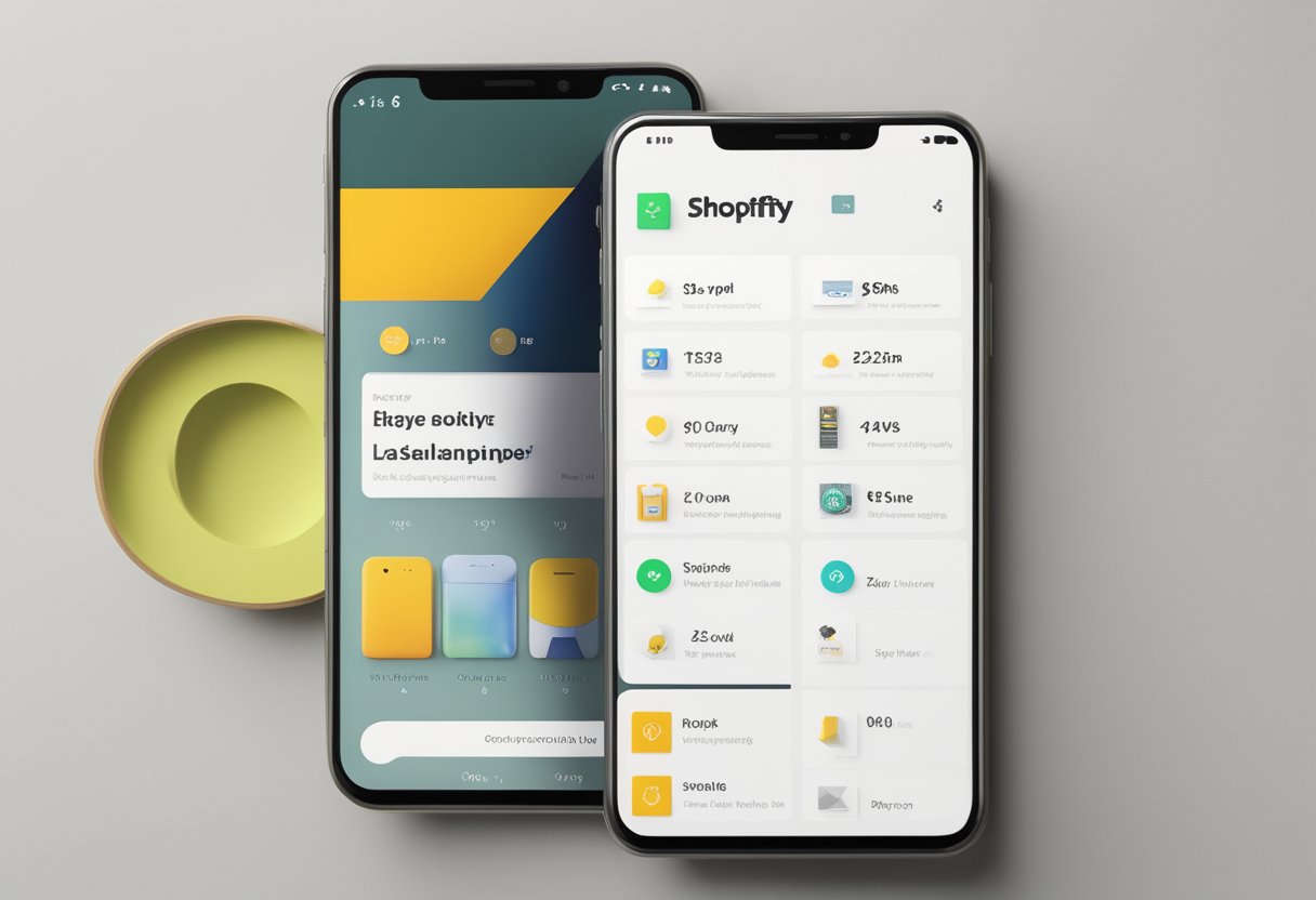
Your mobile Shopify store needs to cater to on-the-go shoppers who expect quick, hassle-free shopping experiences. When users find your store easy to navigate and visually appealing, they’re more likely to complete purchases rather than abandoning their carts.
Creating a Seamless Shopping Journey
Let’s face it – nobody likes a confusing online store!
We’ve found that simplifying your navigation is essential for mobile shoppers. Make sure your menu is thumb-friendly with larger buttons that are easy to tap.
Keep your product pages clean and organized. Include:
- High-quality images that load quickly
- Clear, concise product descriptions
- Visible pricing and shipping information
- Easy-to-find “Add to Cart” buttons
Speed matters tremendously on mobile! Compress your images and minimize pop-ups that might slow down the user experience.
According to the search results, you can use Shopify’s online store speed report to identify slow-loading elements that need fixing.
Consider implementing a permanent navigation bar that stays accessible from any page. This helps shoppers move around your store without frustration.
Incorporating Trusted Elements
We know that building trust is crucial for converting mobile browsers into buyers.
Include a visible satisfaction guarantee on product pages to reassure shoppers about their purchase.
Social proof works wonders! Add these trusted elements to boost confidence:
- Customer reviews and ratings
- Trust badges and security symbols
- Clear return policies
- FAQ sections that address common concerns
For electronics stores especially, detailed specifications and compatibility information help customers make informed decisions. Be upfront about warranties for technology products and accessories.
Show real-world usage of your products through lifestyle imagery. This helps shoppers visualize products in their own lives, especially important for electronics and multipurpose items.
Leveraging Technological Features
We can use modern technology to create standout mobile experiences! A streamlined checkout process is absolutely crucial. The search results emphasize this can significantly improve conversion rates.
Try these tech enhancements:
- One-page checkout to reduce abandonment
- Autofill capabilities for faster form completion
- Multiple payment options (Apple Pay, Shop Pay)
- Progress indicators during checkout
Your admin panel provides valuable insights about how users navigate your store. Use this data to identify and fix common drop-off points in the shopping journey.
Consider adding AR (Augmented Reality) features for electronics products. This will allow customers to visualize items in their space before buying. These modern touches can make your mobile store feel cutting-edge and user-friendly.


