My Blog
Shopify Theme Color Schemes That Will Make Your Online Store Pop in 2025
Picking the right colors for your Shopify store isn’t just about making things pretty. It’s also about creating a shopping experience that connects with your customers and boosts your sales.
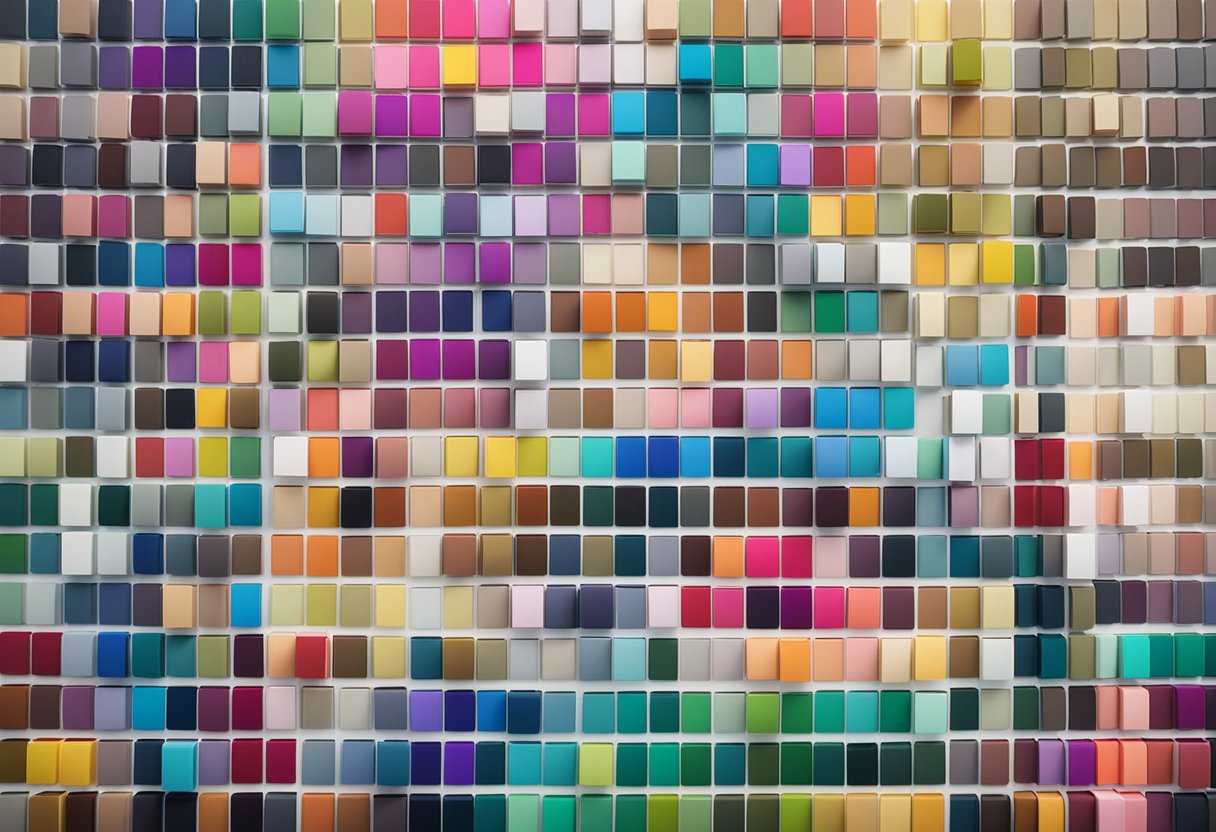
Picking the right colors for your Shopify store isn’t just about making things pretty. It’s also about creating a shopping experience that connects with your customers and boosts your sales.
Color schemes in Shopify themes help you group elements and their respective colors in a visually appealing way. This resonates with your brand identity and improves the overall user experience. Whether you’re going for warm neutrals with a touch of green or elegant blues with neutral accents, the right palette can make your online store stand out from the competition.
The best part? Customizing your Shopify theme’s color scheme is super simple! From your Shopify admin, you can head to Online Store > Themes, click Customize next to your theme, and then use the gear icon to access color options.
This user-friendly process makes it easy to experiment with different palettes until you find the perfect match for your brand.
Let’s dive deeper into some eye-catching Shopify color schemes that successful stores are using, how to implement them effectively, and how the right colors can transform your store’s performance…
Finding the Perfect Color Palette for Your Shopify Store
Selecting the right colors for your online store is more than just an aesthetic choice. The perfect palette can strengthen your brand identity, guide customers through your site, and even influence purchasing decisions.
Understanding the Impact of Color on Branding and User Experience
Colors speak louder than words when it comes to branding. They create instant recognition and emotional connections with your customers. Think about how quickly you recognize brands like Coca-Cola (red) or Facebook (blue) just from their colors!
For Shopify stores, your color scheme sets the tone for the entire shopping experience. A well-chosen palette can:
- Guide user navigation – helping shoppers find important elements like add-to-cart buttons
- Establish brand trust – consistent colors build recognition and reliability
- Reduce bounce rates – pleasing, harmonious colors keep visitors browsing longer
We’ve found that stores with thoughtful color schemes typically see higher conversion rates. The key is balance – too many colors can overwhelm, while too few might bore your visitors.
Color Psychology in Ecommerce
Different colors trigger different emotional responses in shoppers. Understanding these connections can help you make smarter design choices.
Blues create feelings of trust and security – perfect for financial products or technology. Meanwhile, reds generate excitement and urgency, making them great for sales or limited-time offers. Lastly, greens suggest growth, health, and environmental friendliness.
Your product type should inform your color choices:
- Luxury brands often use black, gold, and purple
- Eco-friendly companies lean toward greens and browns
- Children’s products typically feature bright primary colors
Consider your target audience too! Studies show men prefer blue and black, while women respond more positively to purple and green. Culture matters as well – white symbolizes purity in Western countries but mourning in some Eastern cultures.
Navigating Shopify’s Theme Library for Color Inspiration
Shopify makes it super easy to experiment with different color schemes. Their theme library is a goldmine of inspiration!
To access color options:
- Go to your Shopify admin dashboard
- Click “Online Store” > “Themes”
- Find your theme and click “Customize”
- Click the gear icon to access theme settings
- Look for the “Colors” or “Color scheme” section
Many Shopify themes come with pre-set color palettes that work beautifully together. These are professionally designed, so they’re a safe bet if you’re unsure where to start.
Don’t be afraid to browse other successful stores for ideas! We love checking out brands like Turtle Beach, Heinz, and ColourPop for color inspiration. Each has a distinctive palette that perfectly reflects their brand personality.
Customizing Colors for a Unique Shopify Store
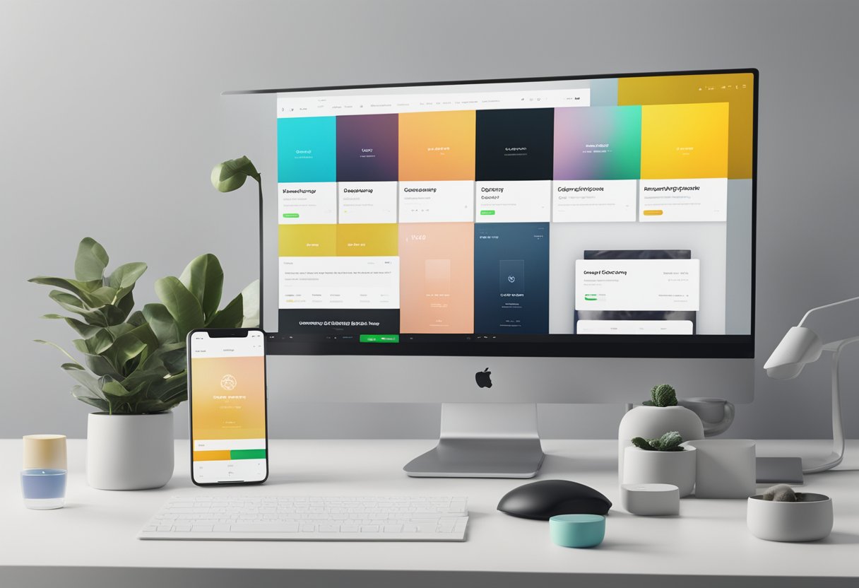
Changing your store’s colors can completely transform how customers experience your brand. A well-designed color scheme helps your products pop and creates a memorable shopping experience that aligns with your brand identity.
The Basics of Theme Customization
Getting started with Shopify color customization is pretty straightforward! To access your color options:
- Log in to your Shopify admin panel
- Go to “Online Store” → “Themes”
- Click the “Customize” button next to your active theme
- Click the gear icon to open theme settings
- Look for “Colors” or “Color schemes” option
Most themes come with pre-built color palettes that you can apply with one click. These serve as great starting points for your store’s look. We recommend picking a primary brand color and 2-3 complementary colors that work well together.
Don’t worry about making mistakes! You can always preview changes before publishing and revert back if needed.
Premium Shopify Themes vs. Free Themes and Color Options
When it comes to color customization, not all themes are created equal. Free themes offer basic color editing, but premium themes typically give you way more flexibility.
Free themes typically offer:
- 2-3 pre-built color schemes
- Basic customization of main elements
- Limited section-specific color options
Premium themes ($180-350) typically offer:
- 5+ professional color palettes
- Advanced color controls for individual elements
- Section-specific color customization
- Color overlays and gradient options
We’ve found that premium themes often include special features like color animations, hover effects, and automatic text color adjustment based on background colors. These small touches can really elevate your store’s professional look.
Tweaking Colors to Showcase Your Products Effectively
Smart color choices can make your products the star of the show! Here are some proven strategies:
- Use neutral backgrounds (white, light gray, cream) for product photography to make items pop
- Create contrast between product containers and the surrounding page
- Highlight “Add to Cart” buttons with a standout color that catches the eye
- Use color psychology strategically (blue for trust, red for urgency, etc.)
We like using color to create visual hierarchies that guide customers’ eyes to important elements. For example, use your boldest color for call-to-action buttons, a complementary color for important information, and neutral tones for general text.
Test your color scheme with actual product images before finalizing. What looks great with a placeholder might compete with your actual merchandise!
Utilizing Shopify Help for Advanced Color Customizations
When you want to go beyond the basic color options, Shopify offers several helpful resources:
- Shopify Help Center – Searchable guides for step-by-step color customization
- Theme documentation – Each theme has specific color features worth exploring
- Shopify Community – Forums where store owners share customization tips
For truly unique color needs, you might need to edit your theme code. Small CSS tweaks can help you adjust colors for specific elements that aren’t controllable through the standard interface.
We recommend using the theme editor’s custom CSS section for simple tweaks. For more complex changes, consider making a duplicate of your theme first as a backup. The Shopify Help team can guide you if you get stuck, just reach out through your admin panel.


