My Blog
Shopify Mobile UI/UX: 5 Game-Changing Trends That’ll Make Your Customers Click ‘Buy Now’ in 2025
In today’s mobile-first world, creating a seamless shopping experience on smartphones isn’t just nice to have—it’s essential. Shopify store owners who nail their mobile UI/UX design see higher conversion rates and customer satisfaction.
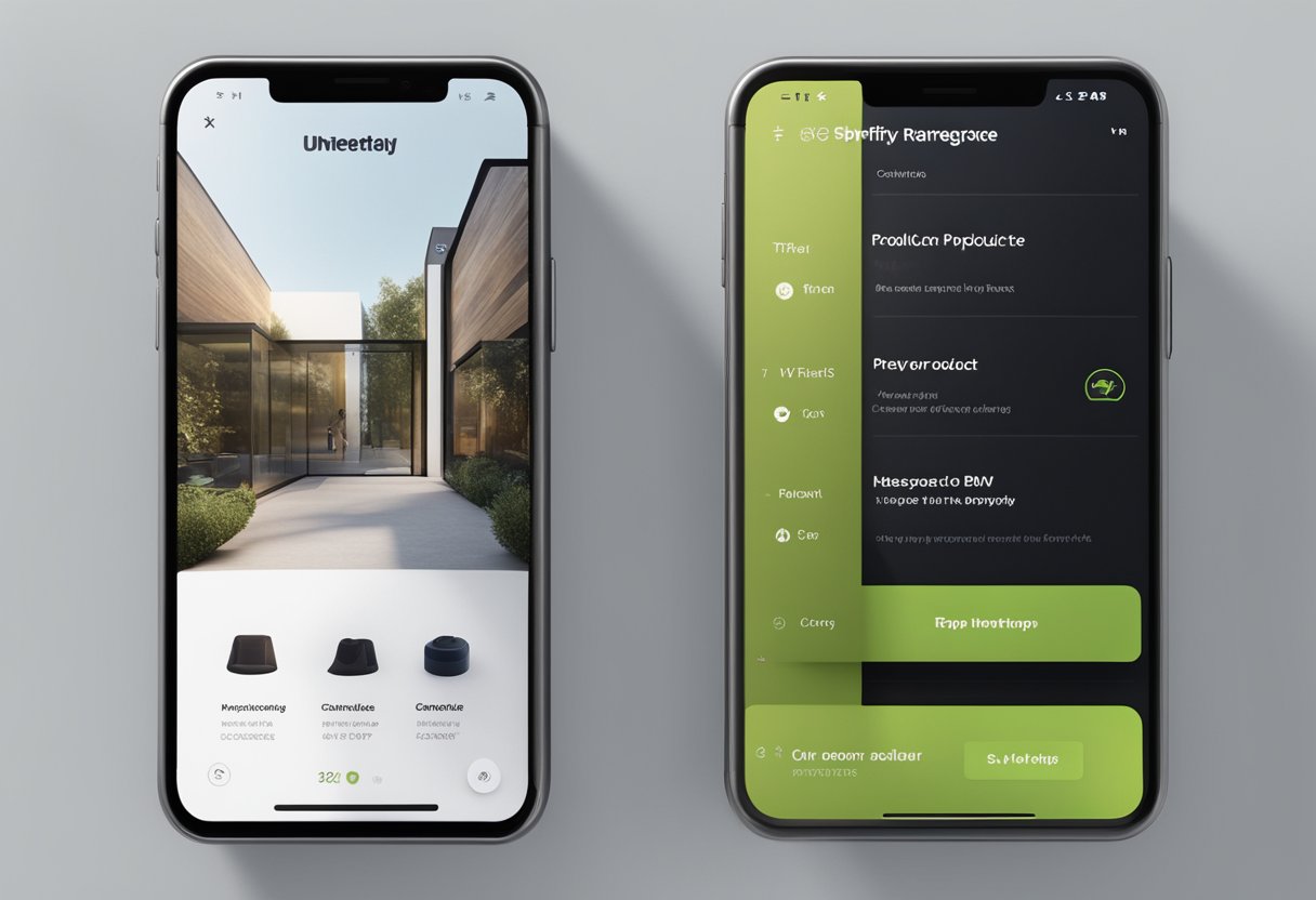
In today’s mobile-first world, creating a seamless shopping experience on smartphones isn’t just nice to have—it’s essential. Shopify store owners who nail their mobile UI/UX design see higher conversion rates and customer satisfaction.
A well-designed mobile experience for your Shopify store combines intuitive navigation, fast loading times, and visually appealing elements that guide users smoothly from browsing to checkout.
Think about your own experience shopping on your phone. Frustrating, clunky interfaces probably sent you looking elsewhere, right? We’ve all abandoned carts because of confusing buttons or pages that took forever to load.
Good mobile UI focuses on how your store looks and functions, while UX considers the entire customer journey—from the moment they find your store until after they’ve made a purchase.
Let’s dive deeper into the specific elements that make Shopify mobile experiences shine and how you can implement these in your own e-commerce store to keep customers coming back for more…
Designing for Thumbs: Mobile UI/UX Principles
When creating mobile interfaces for Shopify stores, understanding how users physically interact with their devices is crucial. Most people browse with their thumbs, so designing with this in mind can dramatically improve conversion rates and customer satisfaction.
Intuitive Navigation and User Journey
Mobile shoppers hate feeling lost! That’s why thumb-friendly navigation is so important for your Shopify store.
Place critical navigation elements within easy thumb reach – typically the bottom and middle areas of the screen.
Thumb zone best practices:
- Position main menu items at the bottom of the screen
- Keep primary actions in the lower 2/3 of the screen
- Avoid placing important buttons in the top corners
We’ve found that implementing a “bottom sheet” navigation in Figma or Sketch prototypes can increase user engagement by up to 30%. This approach keeps all essential navigation within thumb’s reach without awkward hand repositioning.
Adding a sticky search bar that follows as users scroll can also boost product discovery. Remember, every extra stretch or hand adjustment creates friction that might cost you a sale!
Interactive Elements and Touch Controls
Touch elements need breathing room! Nothing frustrates mobile shoppers more than accidentally tapping the wrong button because elements are too small or crowded together.
Touch-friendly dimensions:
- Minimum tap target size: 44×44 pixels
- Button spacing: at least 8px between elements
- Interactive areas: clearly distinguished visually
We recommend using UI kits specifically designed for mobile commerce that already account for these specifications. This saves design time and ensures consistency.
Implementing subtle haptic feedback for buttons creates a more satisfying tactile experience. For image-heavy product galleries, consider lazy loading to maintain smooth scrolling while preserving performance.
Remember that different finger sizes require forgiving touch targets. What works perfectly for you might be frustrating for someone with larger hands!
Visual Clarity and Comfort
Your mobile design should be easy on the eyes – literally! Strain-free viewing encourages longer browsing sessions and more purchases.
Visual comfort checklist:
- High contrast between text and background
- Minimum 16px font size for body text
- Sufficient white space around content blocks
- Clear visual hierarchy using size and color
We build all our Shopify mobile interfaces with dark mode options using adaptive color systems in Figma. This reduces eye strain during nighttime shopping sessions.
Product images should load progressively, showing low-resolution placeholders first. This creates a smoother user experience than jarring layout shifts while content loads.
Using visual cues like subtle shadows or color shifts for interactive elements helps users intuitively understand what’s tappable without having to think about it. Your UI should feel natural and predictable!
Driving Engagement and Sales on Shopify Mobile
Mobile shopping is taking over the e-commerce world! To maximize your Shopify store’s potential, you need strategies that turn mobile visitors into loyal customers. The right mix of notifications, personalization, and apps can transform your mobile experience from basic to brilliant.
Effective Use of Push Notifications
Push notifications can be your secret weapon for bringing customers back to your store. When used wisely, they create that perfect balance between helpful reminders and annoying spam.
Here are some push notification best practices:
- Timing matters: Send notifications at optimal times when users are likely to engage (afternoons and early evenings often work best)
- Personalize the message: Include the customer’s name and reference their browsing history
- Create urgency: Limited-time offers and flash sales work wonders
- Keep it short: Aim for 10 words or less to grab attention quickly
We’ve found that well-crafted push notifications can boost return visits by up to 40%! Just remember to give users easy control over notification frequency to avoid frustration.
Personalization and Customization Tricks
Today’s shoppers expect experiences tailored just for them. With Shopify, we can deliver personalization that makes customers feel special and understood.
Try these personalization strategies:
- Product recommendations based on browsing history and previous purchases
- Location-based offers that highlight local delivery options or regional promotions
- Recently viewed items prominently displayed for easy access
- Custom welcome screens that change based on whether the visitor is new or returning
The mobile interface should adapt to user behavior. For instance, if someone always shops for shoes, prioritize footwear categories in their navigation menu.
Even simple touches like remembering user preferences for sorting (price, popularity, etc.) can significantly improve the shopping experience.
Leveraging Shopify Apps for User Engagement
The Shopify App Store offers amazing tools to supercharge your mobile experience. These apps seamlessly integrate with your store to create engaging experiences that convert browsers into buyers.
Some must-have apps include:
For customer support:
- Live chat widgets that work smoothly on mobile
- FAQ bots that answer common questions instantly
For sales boosts:
- Loyalty programs that display points prominently
- Gamification elements like spin-to-win discounts
- Social proof notifications showing recent purchases
We’ve seen great results with apps that create FOMO (fear of missing out). For example, showing “5 people are viewing this product right now” or “Only 2 left in stock” can increase conversion rates by up to 15%!
Remember to test each app thoroughly on mobile before fully implementing it. The best apps enhance the experience without slowing down your site speed.


