My Blog
Shopify Color Palettes That Will Make Your Store Pop in 2025
Choosing the right colors for your Shopify store can make or break your brand’s online presence. Colors don’t just make your site look pretty—they influence how customers feel about your brand and can even impact their buying decisions.
Choosing the right colors for your Shopify store can make or break your brand’s online presence. Colors don’t just make your site look pretty—they influence how customers feel about your brand and can even impact their buying decisions.
Shopify’s color palettes offer a structured way to create visually appealing stores. They help you connect with your target audience while maintaining consistency across your online presence.
Ever noticed how some online stores just feel “right” when you visit them? That’s smart color selection at work! Shopify’s color system includes 12 different colors with 16 shades each, giving you plenty of options to customize your store.
You can set these colors using hex codes or Shopify’s built-in color picker, making it easy to match your existing branding or create something fresh.
Let’s dive deeper into how Shopify’s color schemes work, explore some eye-catching combinations that successful stores are using, and learn how to create a palette that perfectly represents your brand while improving the shopping experience for your customers.
Color Me Impressed: Understanding Shopify’s Color Palette
Colors do more than just make your store look pretty. They communicate your brand’s personality and guide customers through your site. Shopify offers powerful color tools that can transform your online presence with just a few clicks.
The Basics of Color in Web Design
Color plays a huge role in how people perceive your brand. Did you know that colors can affect buying decisions? It’s true! People make snap judgments about products within 90 seconds, and up to 90% of that assessment is based on color alone.
Good color schemes need three main elements:
- Primary colors that represent your brand
- Secondary colors for accents and highlights
- Neutral colors for text and backgrounds
Balance is key. Too many bright colors can overwhelm visitors, while too few might bore them.
We recommend the 60-30-10 rule: 60% dominant color, 30% secondary color, and 10% accent color.
Typography and color work together too. Dark text on light backgrounds (or vice versa) creates the contrast needed for easy reading.
How Shopify Makes Color Work for Your Brand
Shopify’s color palette is designed with both aesthetics and function in mind. The platform includes 12 colors with 16 shades each! These aren’t random—each has a specific role in the Shopify admin.
Your brand colors should:
- Match your products and brand personality
- Appeal to your target audience
- Create the right emotional response
For example, blue conveys trust and reliability, perfect for financial products. Red creates urgency, great for sales. Green works well for eco-friendly brands.
Shopify makes it easy to implement color psychology in your store. Their color schemes feature consistent palettes for each role, ensuring your site looks professional rather than thrown together.
Remember to test your colors on different devices! What looks great on your computer might look different on phones or tablets.
Navigating Color Options in Shopify Themes
Finding color options in Shopify is super simple. Just head to your theme editor and look for “Theme settings” or “Colors.” Each theme has default color schemes you can customize.
Most Shopify themes let you change:
- Header and footer colors
- Button colors
- Text colors
- Background colors
- Accent colors
We love how you can preview changes in real-time before committing. This makes experimenting with different looks risk-free and fun!
If you’re not design-savvy, don’t worry. Shopify themes come with pre-made color palettes that work well together. Just pick one that matches your brand and tweak as needed.
For more advanced users, many themes allow custom color codes. This means you can input exact HEX, RGB, or HSL values for perfect color matching with your existing brand materials.
Mixing It Up: Advanced Color Customization
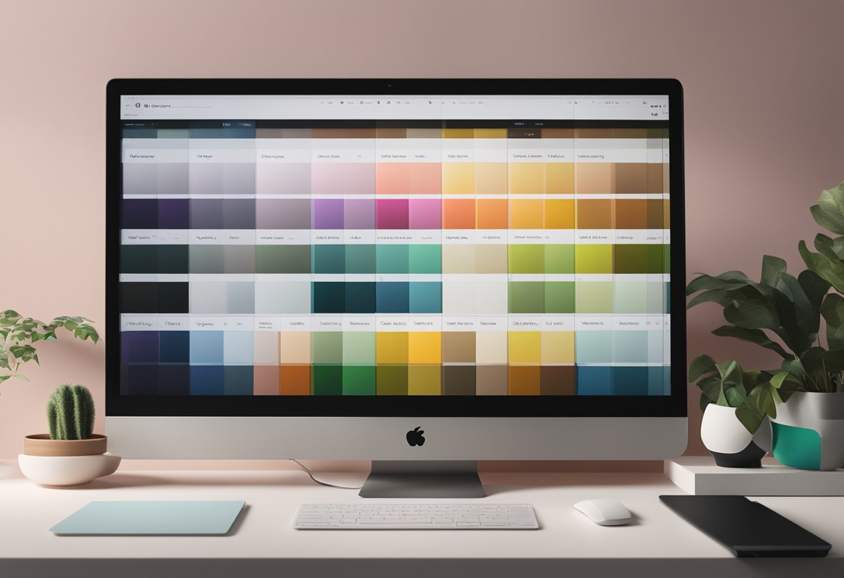
Color customization in Shopify goes way beyond just picking a few basic shades. With the right approach, you can create stunning visual experiences that reflect your brand personality and boost sales.
Creating a Unique Palette With Theme Settings
Shopify’s Theme Settings are your first stop for color customization. To access them:
- Go to Online Store > Themes in your Shopify admin
- Find your active theme and click Customize
- Select Theme Settings and look for color options
Most themes let you adjust primary, secondary, and accent colors. The primary color typically appears in buttons and highlights, while secondary colors work for backgrounds and navigation elements.
Don’t be afraid to experiment! Create a test version of your theme before making big changes.
We’ve found that the most successful stores use 2-3 dominant colors with 1-2 accent colors for visual interest.
Many themes also let you create multiple color schemes that you can apply to different sections. This is super handy for seasonal promotions or highlighting different product categories.
Color and Ecommerce: Enhancing Customer Experience
Colors directly impact shopping behavior – it’s not just about looking pretty! Red and orange create urgency, blue builds trust, and green suggests eco-friendliness or health.
Consider these practical applications:
- Call-to-action buttons: Use contrasting colors that stand out
- Sale badges: Bright, attention-grabbing colors work best
- Product categories: Color-code for easier navigation
- Background colors: Keep them subtle to highlight products
Color consistency across your shop helps with brand recognition. We recommend carrying your palette through to your product photos when possible.
Remember to test your color choices on different devices. What looks great on your computer might appear different on mobile phones or tablets.
CSS Magic: Fine-Tuning Your Shop’s Look
When Theme Settings aren’t enough, custom CSS can take your color game to the next level. You’ll find the CSS editor in the theme editor under “Custom HTML/CSS.”
Here are some handy CSS tweaks:
/* Change hover states for buttons */
.button:hover {
  background-color: #your-color-here;
}

/* Adjust product title colors */
.product-title {
  color: #your-color-here;
}
Typography colors matter too! Consider adjusting heading colors separately from body text for visual hierarchy.
For seasonal promotions, you can create special color schemes without changing your entire site. Target specific sections with custom classes.
Just be careful not to go overboard with CSS changes. They might conflict with theme updates. We always recommend making a backup before diving into code!


